
The following article is about forecasting principles and common forecasting methods. Implementations of the ideas and theories behind forecasts are performed and presented in R.
The Basics of Forecasting
What can be forecast?
Often in forecasting, a key step is knowing when something can be forecast accurately, and when forecasts will be no better than tossing a coin.
Good forecasts capture the genuine patterns and relationships which exist in the historical data, but do not replicate past events that will not occur again (like random fluctuations).
Many people wrongly assume that forecasts are not possible in a changing environment. Every environment is changing, and a good forecasting model captures the way in which things are changing. Sometimes, there will be no data available at all. For example, we may wish to forecast the sales of a new product in its first year, but there are obviously no data to work with. Forecasting should be an integral part of the decision-making activities of management, as it can play an important role in many areas of a company.
Which are the forecasts that are needed?
If forecasts are required for items in a manufacturing environment, it is necessary to ask whether forecasts are needed for:
-
every product line, or for groups of products?
-
every sales outlet, or for outlets grouped by region, or only for total sales?
-
weekly data, monthly data or annual data?
Will forecasts be required for one month in advance, for 6 months, or for ten years? How frequently are forecasts required?
Quantitative forecasting can be applied when two conditions are satisfied:
-
Numerical information about the past is available
-
It is reasonable to assume that some aspects of the past patterns will continue into the future
When forecasting time series data, the aim is to estimate how the sequence of observations will continue into the future. The simplest time series forecasting methods use only information on the variable to be forecast, and make no attempt to discover the factors that affect its behaviour. Therefore, they will extrapolate trend and seasonal patterns, but they ignore all other information such as marketing initiatives, competitor activity, changes in economic conditions, and so on. Time series models used for forecasting include decomposition models, exponential smoothing models and ARIMA models.
An explanatory model helps explain what causes the variation in what need to be forecasted. An “error” term as an argument allows for random variation and the effects of relevant variables that are not included in the model. Progress of ED model (electricity demand) can look like:
\[ED=f(current\ temperature,\ strength\ of\ economy,\ population,\ time\ of\ day,\ day\ of\ work,\ error)\] \[ED_{t+1} = f(ED_t, ED_{t-1}, ED_{t-2}, ED_{t-3},..., error)\] \[ED_{t+1} = f(ED_t,\ current\ temperature,\ time\ of\ day,\ day\ of\ work,\ error)\]These types of “mixed models” have been given various names in different disciplines. They are known as dynamic regression models, panel data models, longitudinal models, transfer function models, and linear system models (assuming that f is linear).
An explanatory model is useful because it incorporates information about other variables, rather than only historical values of the variable to be forecast. However, there are several reasons a forecaster might select a time series model rather than an explanatory or mixed model.
The basic steps in a forecasting task
Step 1: Problem definition
A forecaster needs to spend time talking to everyone who will be involved in collecting data, maintaining databases, and using the forecasts for future planning.
Step 2: Gathering information
There are always at least two kinds of information required:
- Statistical data
- The accumulated expertise of the people who collect the data and use the forecasts
Occasionally, old data will be less useful due to structural changes in the system being forecast; then we may choose to use only the most recent data. However, remember that good statistical models will handle evolutionary changes in the system; don’t throw away good data unnecessarily.
Step 3: Preliminary (exploratory) analysis
- Always start by graphing the data
- Look for consistent patterns
- Look for a significant trend
- Look for an important seasonality
- Is there evidence of the presence of business cycles?
- Are there any outliers in the data that need to be explained by those with expert knowledge?
- How strong are the relationships among the variables available for analysis?
Step 4: Choosing and fitting models
The best model to use depends on the availability of historical data, the strength of relationships between the forecast variable and any explanatory variables, and the way in which the forecasts are to be used. It is common to compare two or three potential models. Each model is itself an artificial construct that is based on a set of assumptions (explicit and implicit) and usually involves one or more parameters which must be estimated using the known historical data.
Step 5: Using and evaluating a forecasting model
Once a model has been selected and its parameters estimated, the model is used to make forecasts. The performance of the model can only be properly evaluated after the data for the forecast period have become available.
The statistical forecasting perspective
When we obtain a forecast, we are estimating the middle of the range of possible values the random variable could take. Often, a forecast is accompanied by a prediction interval giving a range of values the random variable could take with relatively high probability. For example, a 95% prediction interval contains a range of values which should include the actual future value with probability 95%. The average of the possible future values is the point forecasts.
Notation
$y_t|I$ meaning “the random variable $y_t$ given what we know in $I$”
The set of values that this random variable could take, along with their relative probabilities, is known as the “probability distribution” of $y_t|I$ . In forecasting, we call this the forecast distribution.
When we talk about the “forecast”, we usually mean the average value of the forecast distribution: $\hat{y_t}$ . Occcasionally, we refer to the median with the same notation.
We will write, for example, $\hat{y_t}|t-1$ to mean the forecast of $y_t$ taking account of all previous observations $(y_1,…,y_{t−1})$. Similarly, $\hat{y}{T+h}|T$ means the forecast of $y{T+h}$ taking account of $y1,…,y_T$ (i.e., an $h$-step forecast taking account of all observations up to time $T$ ).
Timeseries and ts Objects in R
Timeseries is the opposite of the definition of frequency in physics or in Fourier analysis, where this would be called the “period”.
Frequency of a time series
The “frequency” is the number of observations before the seasonal pattern repeats. wec an create timesies with the ts() function in R. When using the ts() function, the following choices should be used:
Time plots in R
You should always start with time plots, just simple line graphs
Time series patterns
-
Trend
A trend exists when there is a long-term increase or decrease in the data.
-
Seasonal
A seasonal pattern occurs when a time series is affected by seasonal factors such as the time of the year or the day of the week. Seasonality is always of a fixed and known frequency.
-
Cyclic
A cycle occurs when the data exhibit rises and falls that are not of a fixed frequency. These fluctuations are usually due to economic conditions, and are often related to the “business cycle”. The duration of these fluctuations is usually at least 2 years.
When choosing a forecasting method, we will first need to identify the time series patterns in the data, and then choose a method that is able to capture the patterns properly.
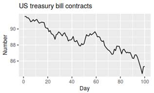
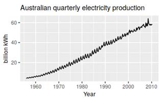
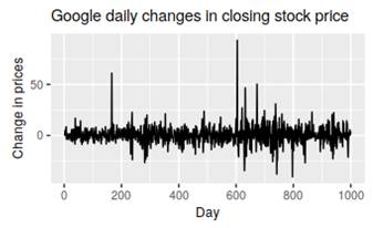
Example of timeseries patterns
Seasonal and cyclic:
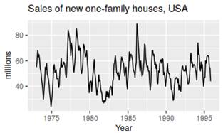
Trending:
Seasonal and trending:
No pattern – random flactuation:
Seasonal plots
A seasonal plot is similar to a time plot except that the data are plotted against the individual “seasons” in which the data were observed. A useful variation on the seasonal plot uses polar coordinates.
Seasonal subseries plots
An alternative plot that emphasises the seasonal patterns is where the data for each season are collected together in separate mini time plots.
Scatter plots
A plot for studying the relationship between features by plotting one series against the other.
Lag plots
scatterplots of quarterly Australian beer production, where the horizontal axis shows lagged values of the time series – useful?
Correlation
Correlation coefficients to measure the strength of the relationship between two variables is defined as:
$r=\frac{\sum(x_t-\overline{x})(y_t-\overline{y})}{\sqrt{\sum(x_t-\overline{x})^2}\sqrt{\sum(y_t-\overline{y})^2}}$
Takes values between −1 and 1 with negative values indicating a negative relationship and positive values indicating a positive relationship. The correlation coefficient only measures the strength of the linear relationship.
Autocorrelation
Measures the linear relationship between lagged values of a time series. re several autocorrelation coefficients: $r1$ measures the relationship between $y_t$ and $y_{t−1}$, $r2$ measures the relationship between $y_t$ and $y_{t−2}$, and so on. The value of $r_k$ can be written as:
$r=\frac{\sum_{t=k+1}^{T}(y_t-\overline{y})(y_{t-k}-\overline{y})}{\sum{t=k+1}^{T}(x_t-\overline{x})^2}$
T is the length of the time series
The autocorrelation coefficients are plotted to show the autocorrelation function or ACF. The plot is also known as a correlogram. Look at the book for more.
r4
is higher than for the other lags. This is due to the seasonal pattern in the data: the peaks tend to be four quarters apart and the troughs tend to be four quarters apart.
r2
is more negative than for the other lags because troughs tend to be two quarters behind peaks.
The dashed blue lines indicate whether the correlations are significantly different from zero. These are explained in Section
Trend and seasonality in ACF plots
When data have a trend, the autocorrelations for small lags tend to be large and positive because observations nearby in time are also nearby in size. When data are both trended and seasonal, you see a combination of these effects.
White Noise
On white noise series, we expect each autocorrelation to be close to zero. Of course, they will not be exactly equal to zero as there is some random variation. For a white noise series, we expect 95% of the spikes in the ACF to lie within ±2/√T where T is the length of the time series. f one or more large spikes are outside these bounds, or if substantially more than 5% of spikes are outside these bounds, then the series is probably not white noise.
Sesonal plots:
ggseasonplot(h02)
Some simple forecasting methods
Average method
meanf(y, h)
Naïve method
Take the last onservation:
naive(y, h)
rwf(y, h) # Equivalent alternative
Seasonal naïve method
we set each forecast to be equal to the last observed value from the same season of the year
snaive(y, h)
Drift Method:
the amount of change over time (called the drift) is set to be the average change seen in the historical data (like drawing a line between the first and last observations, and extrapolating it into the future)
rwf(y, h, drift=TRUE)
sources:
- Forecasting: Principles and Practice book by Rob J Hyndman and George Athanasopoulos