
I recenently did a k-means clustering analysis and along that way I explored different things someone should consider when using k-means, like how to choose the best way to determine the number of clusters or add extra features beforehand in the k-means algorithm for better clustering results. Here are my findings:
Clustering
It can be defined as the task of identifying subgroups in the data such that data points in the same subgroup (cluster) are very similar while data points in different clusters are very different. It is considered an unsupervised learning method since we don’t have the ground truth to compare the output of the clustering algorithm to the true labels to evaluate its performance. We only want to try to investigate the structure of the data by grouping the data points into distinct subgroups.
Why Clustering?
We can get a meaningful intuition of the structure of the data we’re dealing with. Also, different models can be built for different subgroups if we believe there is a wide variation in the behaviors of different subgroups.
K-means
The k-means is an unsupervised learning algorithm that tries to partition the dataset into K re-defined distinct non-overlapping subgroups (clusters) where each data point belongs to only one group. It tries to make the intra-cluster data points as similar as possible while also keeping the clusters as different (far) as possible. It assigns data points to a cluster such that the sum of the squared distance between the data points and the cluster’s centroid (arithmetic mean of all the data points that belong to that cluster) is at the minimum. The less variation we have within clusters, the more homogeneous (similar) the data points are within the same cluster.
How it works
- User needs to specify the number of clusters K
- The algorithm initializes centroids by first shuffling the dataset and then randomly selecting K data points for the centroids without replacement:
- Computes the sum of the squared distance between data points and all centroids
- Assigns each data point to the closest cluster (centroid)
- Computes the centroids for the clusters by taking the average of the all data points that belong to each cluster
- Keeps iterating until there is no change to the centroids. i.e assignment of data points to clusters isn’t changing.
The approach kmeans follows to solve the problem is called Expectation-Maximization.
Implementation
We will implement the kmeans algorithm on a 2D dataset and see how it works. The data covers the waiting time between eruptions and the duration of the eruption for the Old Faithful geyser in Yellowstone National Park, Wyoming, USA. We will try to find K subgroups within the data points and group them accordingly. Below is the description of the features:
- eruptions (
float): Eruption time in minutes. - waiting (
int): Waiting time to next eruption.
With the following code, we start by importing the modules we will need, and upload and plot our data:
import pandas as pd
import matplotlib.pyplot as plt
from matplotlib.image import imread
import seaborn as sns
from sklearn.datasets.samples_generator import make_blobs, make_circles, make_moons
from sklearn.cluster import KMeans, SpectralClustering
from sklearn.preprocessing import StandardScaler
from sklearn.metrics import silhouette_samples, silhouette_score
from sklearn.cluster import KMeans

# Import and clean the data
df = pd.read_csv(
    "https://gist.githubusercontent.com/curran/4b59d1046d9e66f2787780ad51a1cd87/raw/9ec906b78a98cf300947a37b56cfe70d01183200/data.tsv"
)
df["Eraptions"] = df["eruptions\twaiting"].str.slice(stop=6).astype("float")
df["Twaiting"] = df["eruptions\twaiting"].str.slice(start=6).astype("int")
df.drop("eruptions\twaiting", inplace=True, axis=1)


# Plot the data
plt.figure(figsize=(6, 6))
plt.scatter(df.iloc[:, 0], df.iloc[:, 1])
plt.xlabel('Eruption time in mins')
plt.ylabel('Waiting time to next eruption')
plt.title('Visualization of raw data')
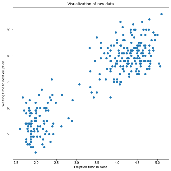
The graph shows that we have 2 clusters in the data.
Before running the k-means for 2 cluster, let’s standardise the data. We will use the sklearn.preprocessing.StandardScaler for the. The StandardScaler standardize features by removing the mean and scaling to unit variance:
The standard score of a sample x is calculated as:
\[z = \frac{(x - u)}{s}\]where $u$ is the mean of the training samples (zero if with_mean=False) and $s$ is the standard deviation of the training samples (one if with_std=False).
In our case this will be:
# Standardize the data
X_std = StandardScaler().fit_transform(df)
We will now run the k-means algorithm for k=2 clusters. I’m using the sklearn.cluster.KMeans algorithm which performs a simple k-means clustering. Some comments about the arguments to keep in mind:
n_initis the number of times of running the kmeans with different centroid’s initialization. The result of the best one will be reported.tolis the within-cluster variation metric used to declare convergence.- The default of
initisk-means++"which is supposed to yield a better results than just random initialization of centroids.
Note that at this point we will be using the n_clusters as the number of clutsers and the max_iter as the maximum number of times that the k-means will recalculate the centroid position.
# Run local implementation of kmeans
km = KMeans(n_clusters=2, max_iter=100)
km.fit(X_std)
centroids = km.cluster_centers_

ig, ax = plt.subplots(figsize=(9, 9))
plt.scatter(X_std[km.labels_ == 0, 0], X_std[km.labels_ == 0, 1],
            c='green', label='cluster 1')
plt.scatter(X_std[km.labels_ == 1, 0], X_std[km.labels_ == 1, 1],
            c='blue', label='cluster 2')
plt.scatter(centroids[:, 0], centroids[:, 1], marker='*', s=300,
            c='r', label='centroid')
plt.legend()
plt.xlim([-2, 2])
plt.ylim([-2, 2])
plt.xlabel('Eruption time in mins')
plt.ylabel('Waiting time to next eruption')
plt.title('Visualization of clustered data', fontweight='bold')
ax.set_aspect('equal')
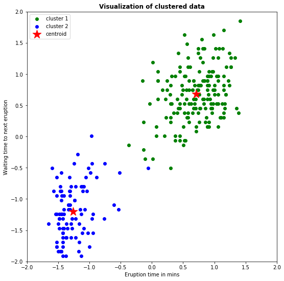
So, we have now generated a plot where the two clusters have differene colors and the centroid is represented by a red star.
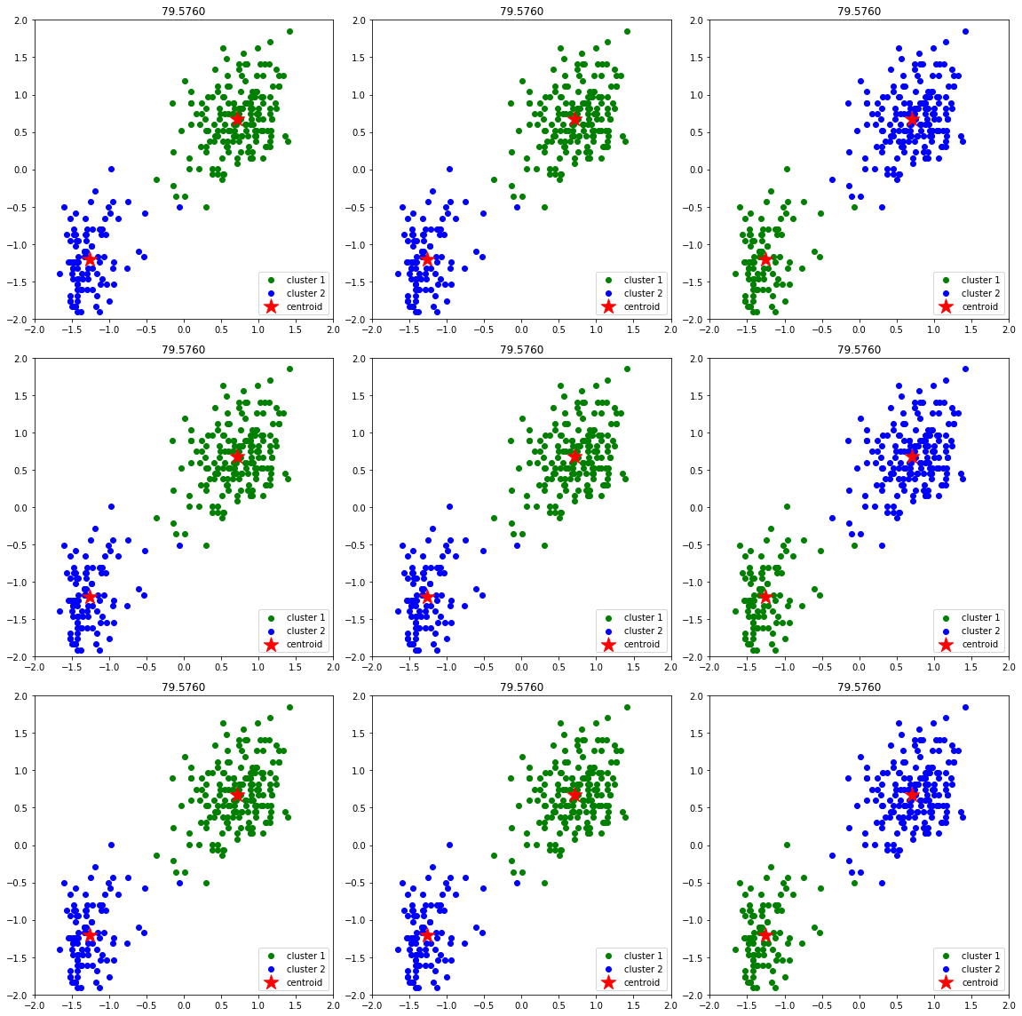
Next, we will se that different initializations of centroids may yield to different results. We will use random_state for random initialization 9 times and we will limit to 3 iterations to see the effect of this. The code looks like this:
n_iter = 9
fig, ax = plt.subplots(3, 3, figsize=(16, 16))
ax = np.ravel(ax)
centers = []
for i in range(n_iter):
    # Run local implementation of kmeans
    km = KMeans(n_clusters=2,
                max_iter=3,
                random_state=int(np.random.randint(0, 1000, size=1)))
    km.fit(X_std)
    centroids = km.cluster_centers_
    centers.append(centroids)
    ax[i].scatter(X_std[km.labels_ == 0, 0], X_std[km.labels_ == 0, 1],
                  c='green', label='cluster 1')
    ax[i].scatter(X_std[km.labels_ == 1, 0], X_std[km.labels_ == 1, 1],
                  c='blue', label='cluster 2')
    ax[i].scatter(centroids[:, 0], centroids[:, 1],
                  c='r', marker='*', s=300, label='centroid')
    ax[i].set_xlim([-2, 2])
    ax[i].set_ylim([-2, 2])
    ax[i].legend(loc='lower right')
    ax[i].set_title(f'{km.inertia_:.4f}')
    ax[i].set_aspect('equal')
plt.tight_layout()
Implementation of k-means for image compression
For this compression I’m using a 429x740x3 image. For each one of the 429x740 pixels location we would have 3 8-bit integers that specify the red, green, and blue intensity values (abbreviation of RGB). Our goal is to reduce the number of colors to 30 and represent (compress) the photo using those 30 colors only. To pick which colors to use, we’ll use kmeans algorithm on the image and treat every pixel as a data point. Doing so will allow us to represent the image using the 30 centroids for each pixel and would significantly reduce the size of the image by a factor of 6.
The code is the following:
# read the image
img = imread('kassandra.jpg')
img_size = img.shape

# Reshape it to be 2-dimension
X = img.reshape(img_size[0] * img_size[1], img_size[2])

# Run the Kmeans algorithm
km = KMeans(n_clusters=30)
km.fit(X)

# Use the centroids to compress the image
X_compressed = km.cluster_centers_[km.labels_]
X_compressed = np.clip(X_compressed.astype('uint8'), 0, 255)

# Reshape X_recovered to have the same dimension as the original image
X_compressed = X_compressed.reshape(img_size[0], img_size[1], img_size[2])

# Plot the original and the compressed image next to each other
fig, ax = plt.subplots(1, 2, figsize = (12, 8))
ax[0].imshow(img)
ax[0].set_title('Original Image')
ax[1].imshow(X_compressed)
ax[1].set_title('Compressed Image with 30 colors')
for ax in fig.axes:
    ax.axis('off')
plt.tight_layout()

The compressed image looks close to the original one which means we’re able to retain the majority of the characteristics of the original image. This image compression method is called lossy data compression because we can’t reconstruct the original image from the compressed image.
Evaluation
When using k-means, we need to determine how many clusters we need to have beforehand and then feed that number into the algorithm. A few ways that help us find the best cluster number are following:
1. The Elbow method
This method gives us an idea on what a good k number of clusters would be based on the sum of squared distance (SSE) between data points and their assigned clusters’ centroids. We pick k at the spot where SSE starts to flatten out and forming an elbow. We’ll use the geyser dataset we first used and evaluate SSE for different values of k and see where the curve might form an elbow and flatten out. The code is the following:
# Run the Kmeans algorithm and get the index of data points clusters
sse = []
list_k = list(range(1, 10))

for k in list_k:
    km = KMeans(n_clusters=k)
    km.fit(X_std)
    sse.append(km.inertia_)

# Plot sse against k
plt.figure(figsize=(6, 6))
plt.plot(list_k, sse, '-o')
plt.xlabel(r'Number of clusters *k*')
plt.ylabel('Sum of squared distance')
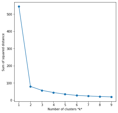
The graph above shows that k=2 is the bect choice.
2. The Silhouette Analysis
The SA is a way to measure how close each point in a cluster is to the points in its neighboring clusters. It can be used to determine the degree of separation between clusters. Values lie in the range of [-1, 1]. A value of +1 indicates that the sample is far away from its neighboring cluster and very close to the cluster its assigned. Similarly, value of -1 indicates that the point is close to its neighboring cluster than to the cluster its assigned. A value of 0 means its at the boundary of the distance between the two cluster.
Definition:
For an example $(i)$ in the data, lets define $a(i)$ to be the mean distance of point $(i)$ with regards to all the other points in the cluster its assigned $(A)$. We can interpret $a(i)$ as how well the point is assigned to the cluster. Smaller the value better the assignment.
Now, let $b(i)$ is the mean distance of point $(i)$ with regards to other points to its closer neighboring cluster $(B)$. The cluster $(B)$ is the cluster to which point $(i)$ is not assigned to but its distance is closest amongst all other cluster.
The silhouette coefficient $s(i)$ can be calculated:
\[s(i) = \frac{(b(i) - a(i))}{max(b(i), a(i))}\]For $s(i)$ to be close to 1, $a(i)$ has be be very small as compared to $b(i)$, i.e. $a(i) « b(i)$. This happens when $a(i)$ is very close to its assigned cluster. A large value of $b(i)$ implies its extremely far from its next closest cluster. Hence, $s(i) = 1$ indicates that the data set $(i)$ is well matched in the cluster assignment.
Note that the definition above doesn’t tell the SA score for the entire cluster, it only idecates the sihlouatte for one data point.
Mean Silhouette score:
Mean score can be simply calculated by taking the mean of silhouette score of all the examples in the data set. This gives us one value representing the Silhouette score of the entire cluster.
Why SA?
You can use SA for an un-labelled data set, which is usually the case when running k-means. Hence, kapildalwani prefers this over other k-means scores like V-measure, Adjusted rank Index, V-score, Homogeneity etc
Examples:
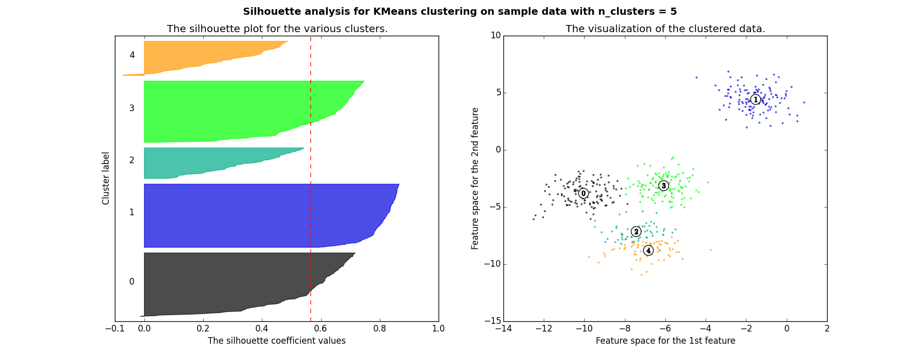
Here are two examples of visualizing the $S$ values.
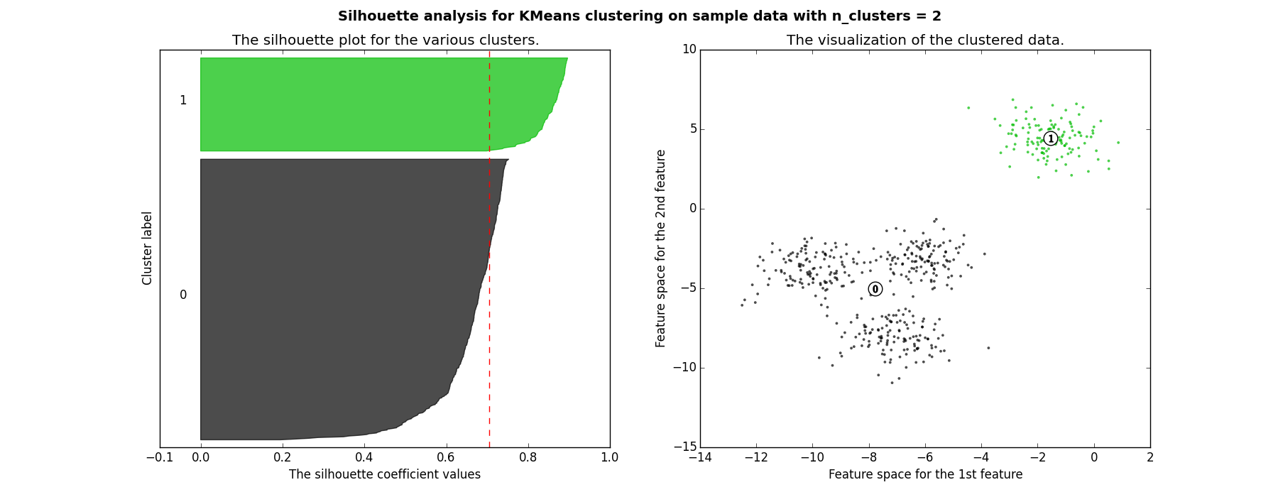
Each shaded area represents the $S$ score for the corresponding cluster and the red dotted line is the mean. The value is roughly around 0.7 which means the clustering is good.
You can now see how some of the following clusters appear a smaller $S$ values, plus the are not unifonmly destributed.
The implementation of the silhouette analysis on our Geyser’s Eruptions datasets is the following:
for i, k in enumerate([2, 3, 4]):
    fig, (ax1, ax2) = plt.subplots(1, 2)
    fig.set_size_inches(18, 7)

    # Run the Kmeans algorithm
    km = KMeans(n_clusters=k)
    labels = km.fit_predict(X_std)
    centroids = km.cluster_centers_

    # Get silhouette samples
    silhouette_vals = silhouette_samples(X_std, labels)

    # Silhouette plot
    y_ticks = []
    y_lower, y_upper = 0, 0
    for i, cluster in enumerate(np.unique(labels)):
        cluster_silhouette_vals = silhouette_vals[labels == cluster]
        cluster_silhouette_vals.sort()
        y_upper += len(cluster_silhouette_vals)
        ax1.barh(range(y_lower, y_upper), cluster_silhouette_vals, edgecolor='none', height=1)
        ax1.text(-0.03, (y_lower + y_upper) / 2, str(i + 1))
        y_lower += len(cluster_silhouette_vals)

    # Get the average silhouette score and plot it
    avg_score = np.mean(silhouette_vals)
    ax1.axvline(avg_score, linestyle='--', linewidth=2, color='green')
    ax1.set_yticks([])
    ax1.set_xlim([-0.1, 1])
    ax1.set_xlabel('Silhouette coefficient values')
    ax1.set_ylabel('Cluster labels')
    ax1.set_title('Silhouette plot for the various clusters', y=1.02);

    # Scatter plot of data colored with labels
    ax2.scatter(X_std[:, 0], X_std[:, 1], c=labels)
    ax2.scatter(centroids[:, 0], centroids[:, 1], marker='*', c='r', s=250)
    ax2.set_xlim([-2, 2])
    ax2.set_xlim([-2, 2])
    ax2.set_xlabel('Eruption time in mins')
    ax2.set_ylabel('Waiting time to next eruption')
    ax2.set_title('Visualization of clustered data', y=1.02)
    ax2.set_aspect('equal')
    plt.tight_layout()
    plt.suptitle(f'Silhouette analysis using k = {k}',
                 fontsize=16, fontweight='semibold', y=1.05)
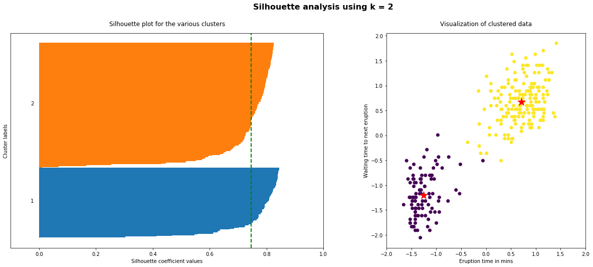
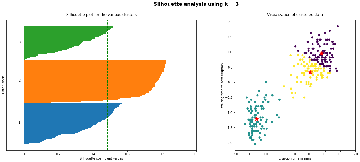
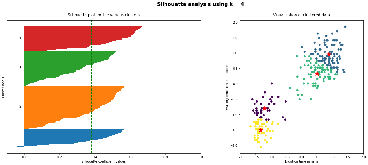
As the above plots shows, n_clusters=2 has the best average silhouette score of around 0.75 and all clusters being above the average shows that it is actually a good choice. Also, the thickness of the silhouette plot gives an indication of how big each cluster is. The plot shows that cluster 1 has almost double the samples than cluster 2. However, as we increased n_clusters to 3 and 4, the average silhouette score decreased dramatically to around 0.48 and 0.39 respectively. Moreover, the thickness of silhouette plot started showing wide fluctuations. The bottom line is: Good n_clusters will have a well above 0.5 silhouette average score as well as all of the clusters have higher than the average score.
Some notes on the Sihlouette Analysis:
- The mean $S$ value should be as close to 1 as possible
- The plot of each cluster should be above the mean $S$ value as much as possible. Any plot region below the mean value is not desirable
- The width of the plot should be as uniform as possible
Additional Implementation of K-means
K-means With Multiple Features
How about clustering based on more than one feature? The k-means clustering happens in n-dimensional space where $n$ is the number of features. The number of dimensions in the vector of each sample would change and there is no need to change algorithm or approach.
The code looks pretty much like the implementation mentioned above, except that the input of the algorithm can now be a dataframe with two or more columns in it. See an example snipet below:
# prepare the datasets
X, _ = make_blobs(n_samples=10, centers=3, n_features=4)
df = pd.DataFrame(X, columns=['Feat_1', 'Feat_2', 'Feat_3', 'Feat_4'])

# run k-means
kmeans = KMeans(n_clusters=2)

y = kmeans.fit_predict(df[['Feat_1', 'Feat_2', 'Feat_3', 'Feat_4']])

df['Cluster'] = y

print(df.head())
You might also want to apply PCA or any other dimentionality reduction method after the clustering for a better visualization of the multiple features.
sources: